Rethinking Zoom's UX design

Zoom is a household name now. It's weird, but a new reality for 2020. I've been able to reliably stay in touch with so many people and even throw surprise birthday parties! It has been one of the products that has kept me busy through this quarantine.
That said, Zoom's UX design is broken. The interface is littered with confusing and repetitive buttons. I wanted to do a redesign of Zoom's core screens with a few things in mind:
- Can we reuse the same call to actions in different places?
- Can we make the 'End Call' button super visible and obvious at all times! Fewer awkward moments, please!
- How can we make it very clear if the mic and cam is on or off?!
- Let's choose to prioritize a few actions: invite, share screen and chat
For context, here is what Zoom looks like now:
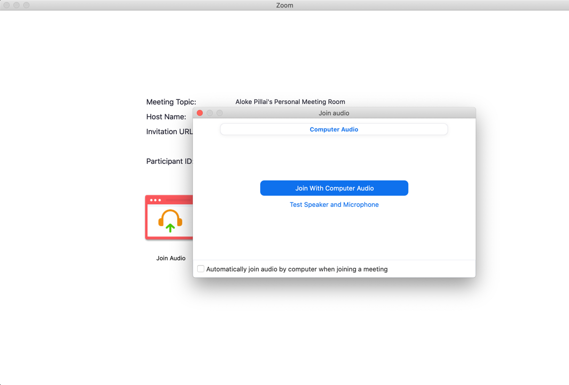
This is the screen you see when you're joining a call. If someone is on video, it will show them in the background. I usually stumble around with the multiple windows before pressing the big blue button. This is one of the areas where a simpler design would improve things.
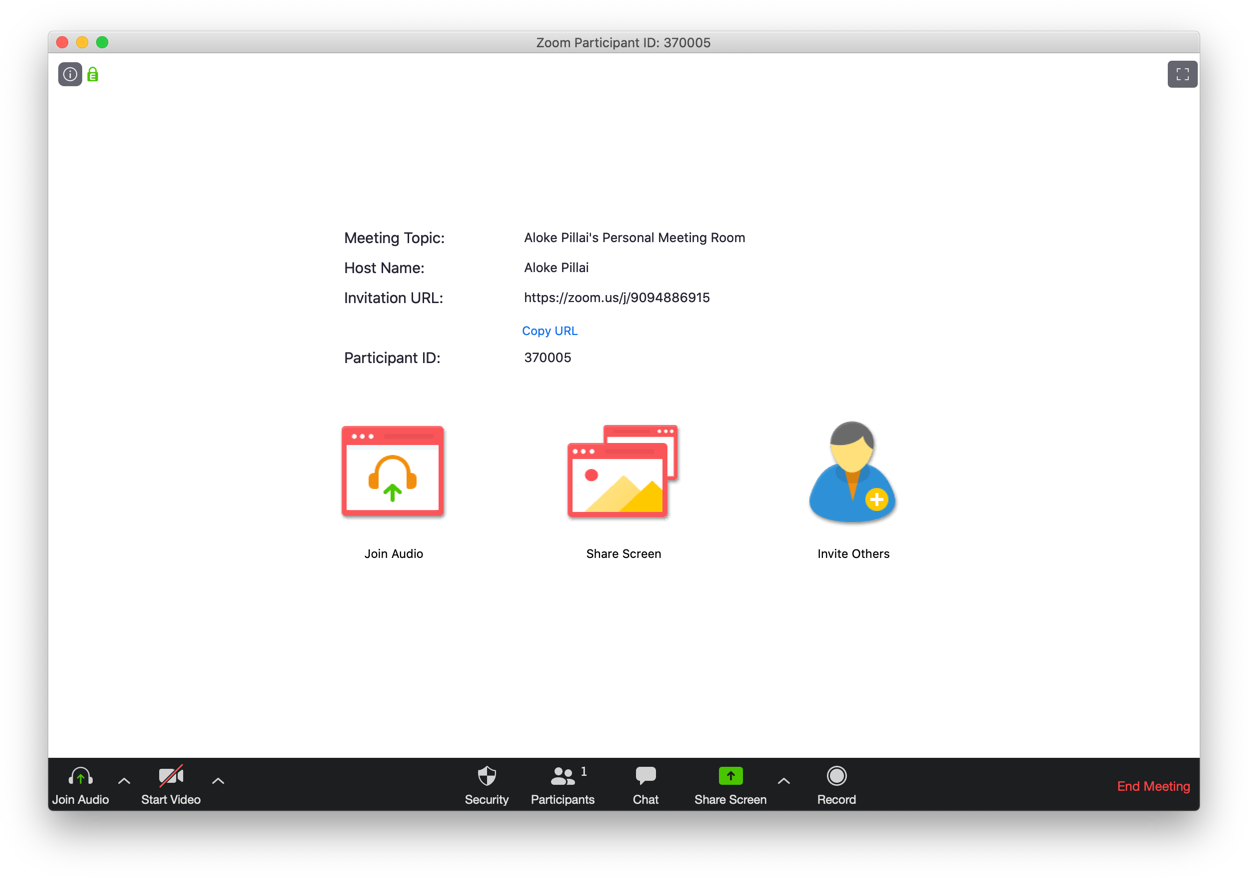
The actual call screen has so many buttons I start to lose track of things. The main ones I care about are: invite, share screen and chat. Everything else should be easily accessible in a menu bar.
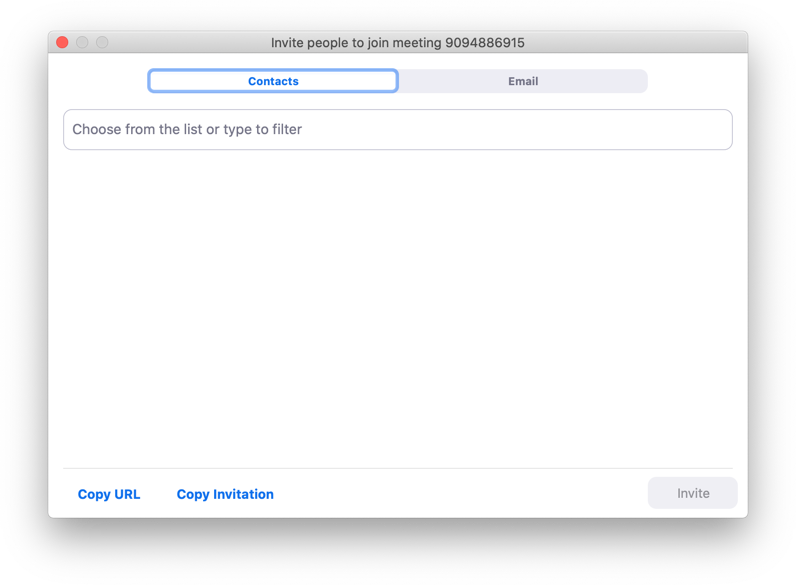
After multiple clicks, this is how you invite someone to the call. Instead of modals, contextual tooltips can conserve space and make the experience more seamless.
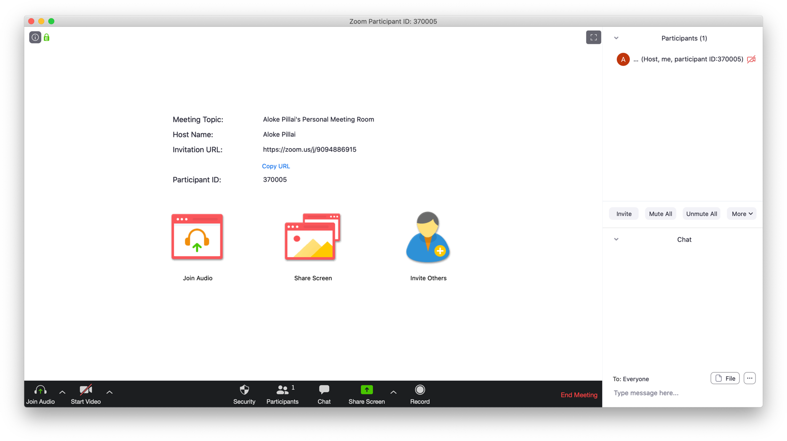
The chat sidebar is another panel that is overloaded with elements, making it confusing to find things during a call.
Redesign:
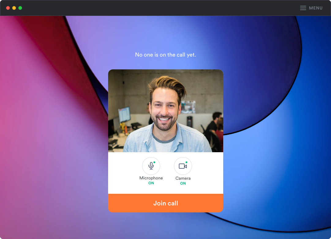
For starters, what if the join screen is limited to:
- Knowing who is on the call
- Buttons to turn my mic and camera on and off
- A big visible button to join the call
This makes it less tedious and nerve-wracking to get everything set up.
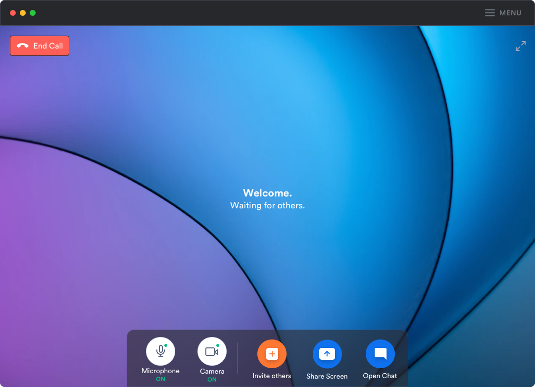
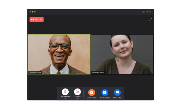
Once you join the call, the main actions are simplified into a dock in the middle. Call actions are blue, making the invite action stand out with an orange.
The end call button is clear and in the corner where Mac users usually move the mouse over to close a window.
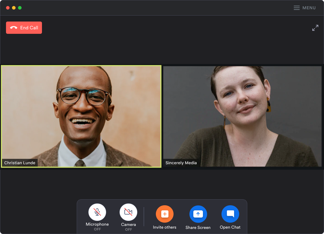
The colors green and red are used to show if the audio/video setup is on or off. The menu button in the top right corner houses all the advanced hosting and recording functions.
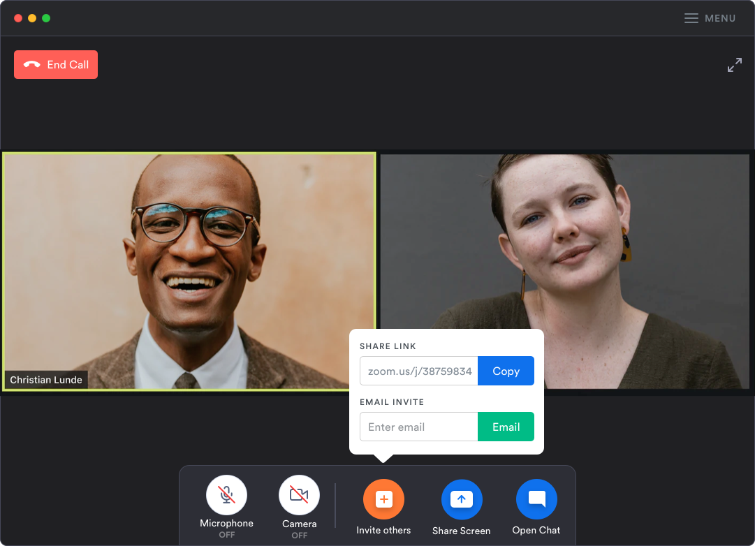
A contextual tooltip makes copying the URL and emailing invites one click away. You can dismiss the tooltip with a click anywhere in the background.
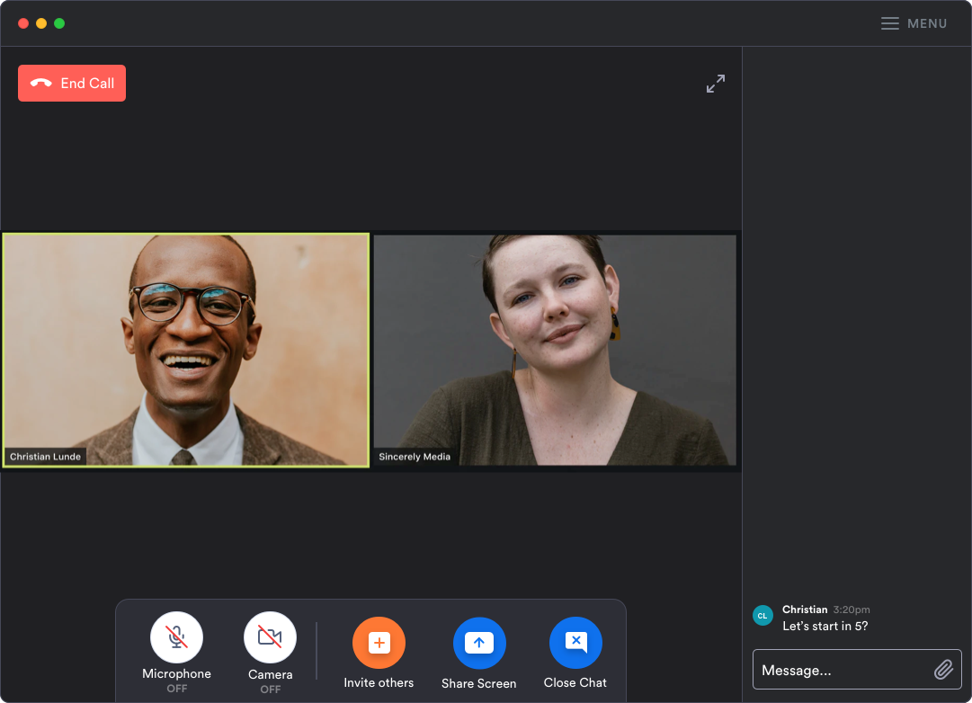
Opening the chat shifts the dock to the left, exposing a simpler design for the text messages during the call.
As a big fan of Zoom, I really hope to see these parts of the product evolve and improve.


